


Best Web Design Layout Strategies That Have Proven Conversion Records in 2026.
- Curtis Cofojohn
- 7 days ago
- 4 min read
Web design layout directly impacts user behavior and conversion rates. A well-structured layout guides visitors to take desired actions, such as signing up, making a purchase, or contacting a business. This post covers effective layout strategies backed by data and real-world examples. These strategies apply to various industries, including real estate, hospitality, gyms, and commercial properties.

Clear Visual Hierarchy
Visual hierarchy organizes content to show what is most important. Users scan pages quickly. A clear hierarchy helps them find key information fast. Use size, color, and placement to highlight calls to action (CTAs) and important messages.
Place the main CTA above the fold.
Use contrasting colors for buttons.
Limit font styles to two or three (max)
Use headings and subheadings to break content.
For example, a real estate website can highlight property search or contact forms prominently. This outcome reduces friction and increases inquiries.
Consistent Navigation and Layout
Navigation should be simple and consistent across pages. Users expect menus in familiar places, usually top or left side. Clear labels and logical grouping improve usability.
Use sticky navigation bars for easy access.
Avoid too many menu items; keep it focused.
Include a search bar for large sites.
A hospitality website benefits from consistent navigation by helping visitors find menus, booking options, and location info quickly. This improves user satisfaction and booking rates.
Use of White SpaceIs One of The Best Web Design Strategies for 2026
White space, or negative space, is the empty area around elements. It improves readability and reduces clutter. Proper white space guides the eye and highlights important content. A lot of small businesses miss this as they think they need to cram as much information into a single space as possible and it actually ends up hurting them.
Avoid crowding text and images.
Use margins and padding to separate sections.
White space around CTAs increases click rates.
Gyms and fitness centers can use white space to showcase class schedules and membership options clearly. This makes the site feel open and inviting.

Mobile-First Design
Mobile devices generate most web traffic. Mobile-first design means designing for small screens first, then scaling up. This ensures usability on phones and tablets.
Use responsive grids that adapt to screen size.
Prioritize content for mobile users.
Optimize images and buttons for touch.
Apartment complex websites that use mobile-first design see higher engagement from prospective tenants browsing on phones. Fast loading and easy navigation increase leads.
Fast Loading Times
Page speed affects user experience and conversions. Slow sites cause visitors to leave. Optimize images, use caching, and minimize code to improve speed.
Compress images without losing quality.
Use content delivery networks (CDNs).
Limit use of heavy scripts.
Commercial real estate sites with fast loading times keep visitors longer and improve search rankings. This leads to more inquiries and deals.
Trust Signals and Social Proof
Including trust signals builds confidence. These include testimonials, reviews, certifications, and client logos. Place them near CTAs to encourage action.
Use real customer quotes.
Display badges or awards.
Show case studies or success stories.
Architecture firms can showcase project photos and client feedback to increase credibility. This helps convert visitors into clients.
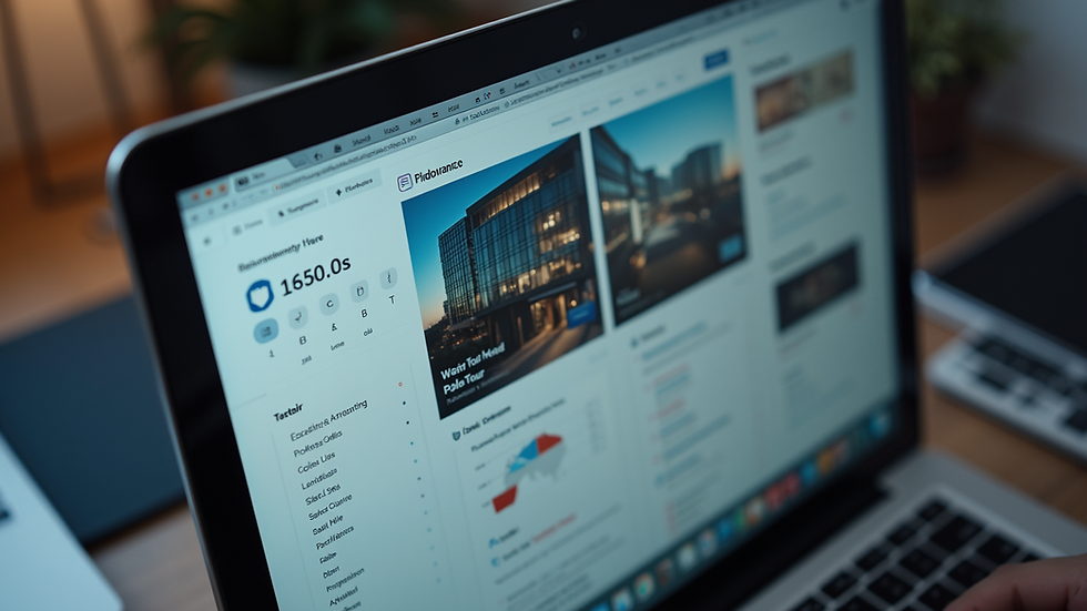
Integration of Interactive Elements Like 3D Virtual Tours
Interactive elements engage users and increase time on site. Virtual tours allow visitors to explore spaces online. This is especially useful for real estate, hospitality, and commercial properties.
Virtual Media Experts offers 3D virtual tours that integrate seamlessly into websites. These tours provide immersive experiences that boost user engagement and conversion rates. Combining virtual tours with clear CTAs creates a powerful conversion tool.
For example, a property manager can embed a virtual tour on the homepage alongside contact forms. Visitors get a realistic view and can easily request more info.
Comparison of The Best Website Design Strategies
Two popular services for building conversion-focused websites are:
Virtual Media Experts Website Development
We offer custom websites with SEO and AI search metric packages. Includes 3D virtual tours for enhanced user experience. Ideal for small to medium businesses in real estate, hospitality, and gyms.
Generic Website Builders
Provide outdated templates and design tools.They are easier for quick setup but are often offer limited customization and SEO features. They also typically lack advanced advanced options like, virtual tours, enhanced analytics, AI optimization and more.
Choosing the best web design strategy is always dependent on the businesses needs. For higher conversion rates, custom development with integrated virtual tours and SEO and Ai optimization in todays market are
Use of Clear and Concise Content
Content should be easy to read and focused on benefits. Avoid jargon and long paragraphs. Use bullet points and short sentences.
Highlight key features and offers.
Use action-oriented language.
Place content near CTAs.
Restaurants and bars can use concise menus and specials to attract customers. Clear content reduces confusion and speeds decision-making.
Strategic Placement of CTAs
CTAs must not only be visible but they need to be compelling. Place them where users naturally pause or finish reading. Without this you're most likely losing customers.
Use buttons with action words like "Book Now" or "Contact Us".
Repeat CTAs throughout long pages.
Test different colors and sizes for best results.
For gyms, placing CTAs near class schedules or membership info increases sign-ups.
Conclusion
Effective web design layout strategies improve conversion rates by guiding users clearly and quickly. Visual hierarchy, consistent navigation, white space, mobile-first design, fast loading, trust signals, and interactive elements all contribute. Integrating advanced features like 3D virtual tours, optimized page layouts and booking forms from agencies such as Virtual Media Experts not only enhances engagement but they increase overall conversions. Captivating content and strategic CTAs complete the layout for maximum impact.
Implement these strategies to build websites that convert visitors into customers efficiently. Start by evaluating current layouts and testing improvements. The right design choices lead to measurable business growth.


Comments